Uncategorized

Handling slicer hierarchies with creative conditionally formatted buttons

To start – this problem is fairly common, but also pretty niche. If this scenario does not work for you, hopefully it will at least spark some ideas on how to use conditionally formatted buttons!

When creating extremely refined user experiences in Power BI, it is important to avoid having your end users get lost in the filtering process. I was working on the Cloud9 reporting when faced with this issue, and came up with this cool idea to handle it that I have since implemented in multiple reports with customers.

Problem

Often, Power BI reports will have a set of slicers that operates as a hierarchy. When navigating the filters, an end user will start from the top layer, and work their way down the hierarchy to the desired filter depth. All good… until it is time to change your filters! To get back to the point where the top layer can be adjusted, the user will have to deselect back up the same hierarchy of slicers to then change that top layer. (While the hierarchy slicer itself is a fairly good way to handle this, it is not always the cleanest implementation to your design)

Note: this method is ideal when your top layer in your slicer hierarchy has just a few distinct values. If you have more than 4, use the hierarchy slicer instead and work your design around it, because this will not be practical.

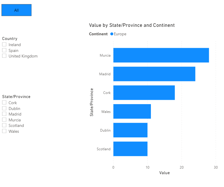
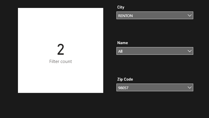
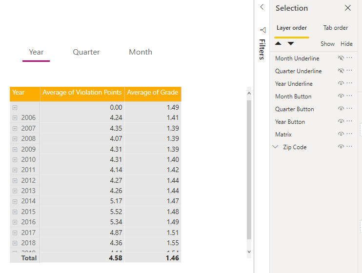
In this example, I am using a hierarchy of Continent, Country, and State/province:

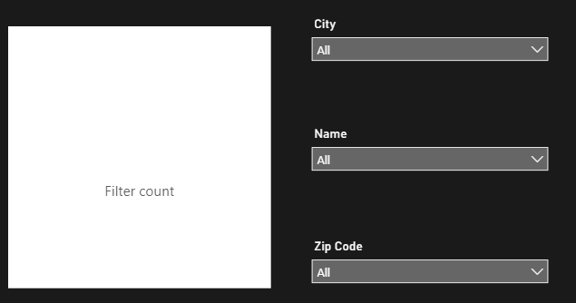
As you can see, you have to work back up the hierarchy to switch out your Continent. It is possible to turn the slicer interactions off so the selections will stay available and clickable, but this will result in Blank visuals and a bad user experience:

Solution: Bookmarking and Conditionally formatted buttons

To start, we are going to create a button for each of our Continents, as well as an “All” Button. These will eventually replace our Continent slicer (but don’t delete your slicer!) :

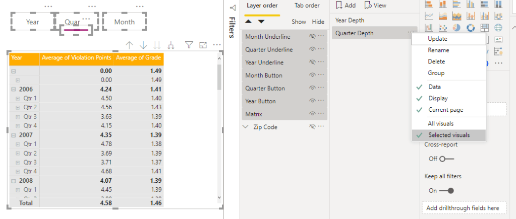
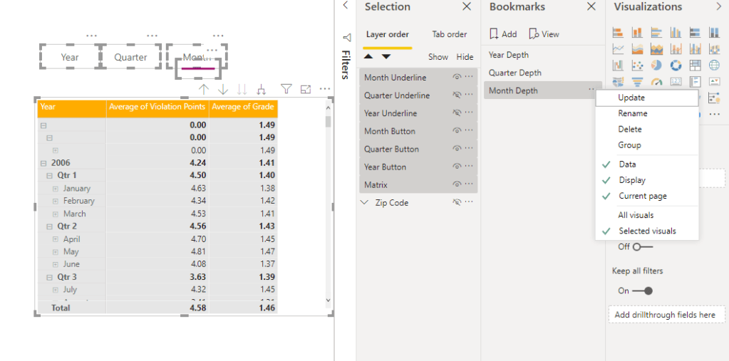
Next, we will create bookmarks that impact all of our slicers. The “All” bookmark will reset all slicers to no selections.

IMPORTANT STEP: Hide your Continent Slicer! Don’t worry, we are going to use it still… we just don’t want it to show because our buttons will act as the slicer for continent. The slicer still works even when hidden.

Select your slicers, create a new bookmark, and toggle on “Selected visuals”

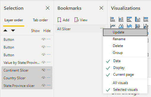
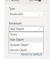
You can now assign this bookmark to the “All” Button:

Next, we will repeat the same steps for North America and Europe top layers.

Unhide your continent slicer, and select North America, then hide the slicer and repeat the bookmarking process

IMPORTANT: Leave your Country and state/province slicers UNSELECTED. We want them to reset when we toogle across our buttons to avoid the aforementioned Blank issue.

Repeat the same steps for Europe

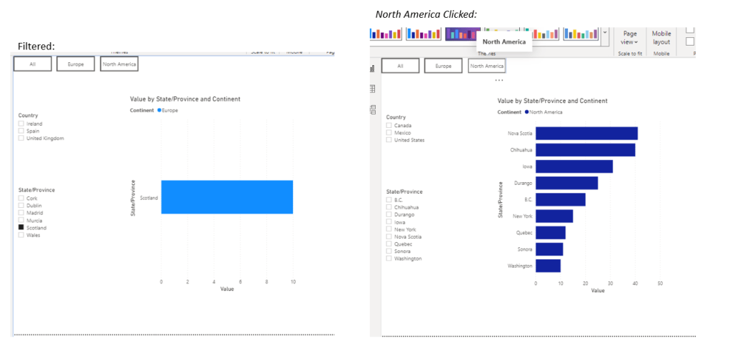
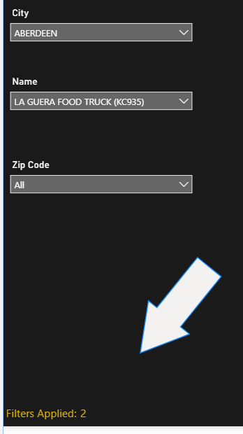
Now check your buttons and validate they are working as expected. To see the impact, select a slicer item for a State/Province, then click a button for a continent and see that your slicers will reset:

Now that all of our buttons are linked up and bookmarks are ready, we need a good way to tell the user which continent they have selected. This is where our conditionally formatted buttons come into play!

Conditionally formatting buttons

There are many ways to do this, and you will likely have a better way to get the DAX right to handle it if you are really good with DAX. I admit that I am a hack when it comes to DAX 🙂

Create Measures for your conditional formatting

We need to translate our Distinct values from the top layer into numbers to make the conditional formatting work, so we will start with some simple dax:

Conditional buttons = IF(ISFILTERED(‘Table'[Continent]), IF(FIRSTNONBLANK(‘Table'[Continent],0)=”North America”, 1, IF(FIRSTNONBLANK(‘Table'[Continent], 0)=”Europe”, 2)), 0)

This will return 0 for “all”, 1 for “North America” and 2 for “Europe”

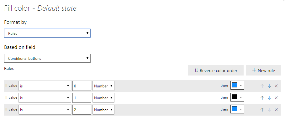
Apply our formatting to the buttons.

This part can be as complex as you want it to be. I will show conditional formatting of the Fill and the Text color, but you can take it much further than that if needed.

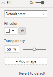
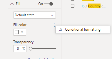
Start with your “All” button, and go to Fill and select the conditional formatting Icon:

Apply formatting to darken the button when in a “selected” state

No do the same thing for Text Color on the button, but lighten that one to make it show up better:

Optional: Take it to the next level with conditionally formatted Hover Actions

For high quality user experiences, it is important to make things operate as the end user would expect them to. One of the ways to highlight something is clickable is to give it a good hover action.

I like to have my “Selected” buttons have no change on Hover, and my unselected items change color to show they are clickable.

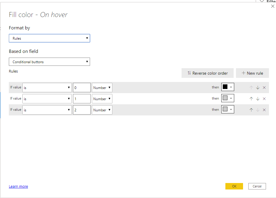
We can achieve all of this via the same steps above, but toggling to the “Hover” state and modifying our coloring:

The coloring is a little counterintuitive. We want it to look different on hover but ONLY when it is not also “Selected”, so we match our selected state formatting when our measure = 0, and give it a different tone when not:

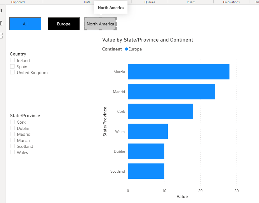
We now have an “All” button that looks selected when there are no continents filtered:

Looks unselected when one of our other options is selected:

And gives the hover effect needed to show it is a clickable item:

Apply to the other buttons

Now use the format painter to apply the same formatting to Europe and North America buttons, and Modify your rules to apply the same Selected/Unselected formatting for their respective numbers (Europe = 2, North America = 1):

North America formatting:

Here is our end result:

With Hover action:

Currently, Buttons support conditional formatting on the following:

  • Text (Text itself)
  • Font Color
  • Icon Line color
  • Outline Color
  • Fill Color (Not transparency though!)

If implemented well, this solution will prevent your end users from having to navigate back up the hierarchy to make further selections, and avoid conflicting filters that end up causing your users to see blank visuals.

PBIX available to download here

Uncategorized

Consolidating report elements for improved performance

I was recently brought into a report design review to see what we could do about performance of the report page load. The model was optimized and the DAX was running very quickly, but they were seeing 25+ second page load times.

At a glance the page appeared to have quite a few visuals, including a bunch of cards. Using the Performance Analyzer, we were able to determine that not only were there a ton of visual elements, there were also many design specific elements, such has shapes and backgrounds, and text boxes. It turned out there were over 160 elements on the page.

Every element on the page has a cost

You would think that a shape alone would not cost any performance, but due to javascript being single threaded, there is a limit on how many elements can render concurrently. The limit is highly dependent on Browser and your PC.

If you take a look at the Performance Analyzer and expand a particular element, you will see an “Other” bucket. This Other bucket captures the time spent waiting for other objects to render. The more elements on the page, the bigger the Other bucket.

After reviewing the customer report, we came up with ideas on how to consolidate the visual elements and the report design elements to limit the number of visuals and decrease our “Other” bucket. In this case in particular, after implementation we saw a 70% performance improvement, taking render times from 25-30 seconds down to 5-8 seconds.

Implementation

I mocked up a less extreme example to share the steps we took so could share the concepts here

To start, here is my “Before” view:

Step 1. Consolidate Card Visuals

A well formatted Matrix can give you the same look and feel as a bunch of individual cards, while improving performance by limiting the number of visuals on the page, as well as benefiting from DAX fusion for more optimal queries.

While the formatting will be very specific to your reporting needs, this should provide an idea of ways to implement this idea.

I have two sets of cards in this case that can be converted to Matrices, but each one has dramatically different formatting options.

Starting with the left side set of cards and text labels:

Create a new Matrix and drag the measures needed into Values in the visualization pane in the order in which you want them displayed vertically:

Now go change the Style of your matrix to “None” in the formatting pane

The most critical part to this formatting is to change your Values to “Show on Rows”

By switching this toggle on, we move the matrix from displaying horizontally to vertically.

We also want to remove the Outline on our Row Headers and Column headers so we do not have extra lines on the matrix:

Next you will want to resize your Row Headers and Values to feel more like Cards. For example, larger fonts for the values with your row headers acting as the labels. In this case I used 20 for the values and 10 for the Row headers.

Next we will go to the Grid section and add some padding to our rows to space this out a bit:

While formatting is not as exact, we are able to get very close:

The next set of cards to tackle is the horizontal one up top:

Formatting of this one is pretty straight forward. Drag your metrics into values:

Now change style to None and remove all Outlines like we did on the previous matrix

In this case, rather than worrying about padding we need to set our column width manually by clicking and dragging to gain the separation we want.

It is also important to turn off Auto-size column width, and size your columns with enough room to handle your range of values. You don’t want to end up with numbers that run off. You will also want to Center your column header alignment:

Similar to the previous matrix, increasing the size of the values will give it that card look and feel.

Our last step for this matrix is to use the “Field Formatting” to Center our alignment for each metric:

Now that our Cards are consolidated, we can move on to the design elements

Step 2. Move everything you can to the background

At a glance is is hard to notice, but this report page has 7 elements that are strictly for design.

Red boxes denote an element in the report

By using the methods from my post on Backgrounds, we are able to convert those 7 elements into a single background.

Once we bring in the background with our new matrices, we have moved from 25 elements on the page down to 5 without sacrificing any content

Before:

After:

And the results in the Performance Analyzer are staggering:

Conclusion

There is no decisive answer to the question of “How many elements is too many?” Each report build is different and each set of users have different expectations for performance. It is important to weigh performance and insights and find a good balance. Taking advantage of the techniques in this post will pack more insights into your reporting without sacrificing performance.

Uncategorized

Creative filter display

I saw this post on r/powerbi today asking about filter alerts: https://www.reddit.com/r/PowerBI/comments/hyqpxd/filter_alert/ and it inspired me to make my first post in a while. While this method might not always meet the need for things like screenshotted reports where you want the filters selected to be displayed, it’s a cool way to handle the problem of identifying what filters are applied to a report page.

Our goal is to land a card displaying the number of dimensions we are filtered on to give the end user the ability to quickly see that filters are applied, and then hover on the card to see which filters are applied:

*Note that this does not count how many individual fields of a dimension are selected

Step One: DAX

The key to this method is creating DAX that will calculate the number of dimensions filtered. This is easily done through IF ISFILTERED functions that return a 1 for filtered, and 0 for not filtered, and then adding them up for all of the dimensions we are using as filters.

In this example, I am going to filter on the dimensions of City, Name, and Zip Code. Here is the DAX:

Filter count = IF(ISFILTERED(‘Table'[City]), 1, 0)+IF(ISFILTERED(‘Table'[Name]),1,0)+IF(ISFILTERED(‘Table'[Zip Code]), 1,0)

And here is the outcome:

Now I will adjust the DAX so rather than a 0, we end up with a blank (note this is probably not optimal DAX, but it is functional. there is probably a better way to do this if you are a DAX lover):

Filter count = IF(IF(ISFILTERED(‘Table'[City]), 1, 0)+IF(ISFILTERED(‘Table'[Name]),1,0)+IF(ISFILTERED(‘Table'[Zip Code]), 1,0) = 0, “”, IF(ISFILTERED(‘Table'[City]), 1, 0)+IF(ISFILTERED(‘Table'[Name]),1,0)+IF(ISFILTERED(‘Table'[Zip Code]), 1,0))

Now we will create one more Measure to take care of the display label:

Filter count display = IF([Filter count]=””, “”, “Filters Applied:”)

Now that we have the DAX work done, it is time for formatting and placement

Step 2: Formatting the visuals:

There are three components to formatting for this. First, we will format and place the card and label (if applicable) itself, then we will format the Visual header and Filter pane to land the user experience.

The key to this feature is to make it subtle yet noticeable. If you use custom slicer panels, a good placement is with your button to active the slicer panel. If not, I like to go with lower corners or upper corners, but also need to call out that the number is representing the filters. I am going to demonstrate the latter, as it is more common.

Start by creating a button that uses conditional Button text referencing the “Filter count display” measure we created above and has all other options turned off and give it a color that will stand out:

Next, we format the card with “Filter Count” measure in it to align with the Button. Here are a couple screenshots of the effect we created:

No Filters applied
1 Dimension filtered
2 Dimensions filtered

*This could totally be done as One measure that concatenates “Filters Applied” with the number, but Buttons do not have the Filter Icon in the visual header, and Cards do not allow the formatting precision required to make this perfect.

Now that we have taken care of the display, we need to bring in the ability to see what filters are applied. We are going to utilize the “Filter icon” Visual header of the card, and formatting of the filter pane to do this.

Step 3: Formatting the visual header

First things first, turn on the visual header if it is off and turn off all of the visual header elements except Filter icon.

I say this all the time, but it is incredibly important to be intentional with your visual headers! If the option is not one you want the user to work with, turn it off. It will eliminate confusion and give a clear purpose for the header.

We now have a flyout list of filters applied when hovering on the Filter Icon:

But we are not done yet! The formatting of the filter flyout is based on the formatting of the Filter Pane, so we will want to customize the Pane to give this a consistent look and feel with the rest of the report. This might be done already if you take formatting that far and use the filter pane already.

Step 4: Formatting the filter pane and filter cards

To format the filter pane/filter cards, we start by clicking in blank space of the report. this allows us to see the filter pane formatting options under the visualization pane

Apply a consistent color scheme to the pane and filter cards

The formatting of the individual filters that pop up is done via Filter cards > Type: Applied

And here is how it looks with multi-select on a slicer:

Conclusion

While this is not the most “in your face” approach to displaying what filters are hitting a report, it can subtly be built into any report without taking up a ton of real estate and add a ton of value. In addition, dynamic Alt Text can be added to this Card to aid with accessibility. Hope this is helpful! PBIX can be found here for download.

Uncategorized

Themeable Backgrounds for Power BI

I came up with this concept while working on the front end of the Regional Emergency response solution. When trying to templatize some work that was done for a specific customer, I realized that the accent color I had applied would not look good when branding for other customers – as dark logos did not show up well against a dark blue background.

Transparency in PowerPoint

To get around the branding issue, I switched from dark blue to White accents in the banner…. and hated it. I went with this version for a couple days, and then one night at around midnight an idea popped into my head…

What if I cut out sections of my background image and let the page background show through??? I was excited to try it out so I shot out of bed and headed to the computer. It was a little painful at first to land the shapes how I wanted to, but it worked!

How to build your background in PowerPoint with Transparent Elements

If you are not familiar with my process for building backgrounds, check out my post on Background Concepts to get started.

Merging Shapes

Start off by building your complete background with your ideal accents. I will keep this one simple so it is easy to follow, but you can get very advanced using these techniques.

Next, Select your underlying shape (big rectangle in this case) and your accent shapes. Be intentional with your click order here, as PowerPoint will use the formatting of the first selected object in the next step.

With your objects selected, go to the Shape Format options in the ribbon and Select Merge Shapes and combine

You are now left with a big rectangle underlying that has cut-out transparency

Bring your new background into Power BI Desktop

You can now edit your accent colors by adjusting your Page Background color in the visualizations pane:

If you have really complicated shapes you can look at using the other Merge Shape functions, such as Fragment.

Hope this is helpful! Check out the background gallery to download this background example and more.

bookmarking

Matrixed Report Navigation

I was recently tasked with revamping the Microsoft 365 Usage Analytics template app, as it was created several years ago and could benefit from many of the new features in Power BI.

When I initially opened the report the first thing I noticed is that it was 26 tabs. 26 tabs is a LOT of tabs. When a report is structured with this many tabs, it can lead to a linear consumption experience where to end user goes through each tab in sequence to wade through the information, and navigating to a specific piece of information can be a challenge.

We did a quick inventory of the 26 tabs, and decided on a “Matrixed Navigation” that would consolidate tabs and make for a better user experience. At the end of the day, we ended up with 5 Topics or “Categories” of depth and built in navigation to let users navigate the vast amount of content in the report within these categories. This was achieved by looking at commonalities in each tab and consolidating at the right depth to make for the most seamless user experience.

Pre-Built Matrixed Navigation Template

I have found that using this Matrixed navigation approach has been successful when working with really heavy Reports that cross many topics and depths of content, so I wanted to share an example PBIX that has all of the Navigation components built in and ready to be used!

As I mentioned in my post on In-Page Navigation, prior to Visual grouping, I would never have suggested using this kind of navigation, as it was far too tedious to achieve, and hard to update when things needed adjustment. Luckily, when developing the redesign of the Usage analytics reporting, Visual grouping was in test so I was able to utilize it in the build and discovered some really cool functionality when combining Visual groups with Bookmarks

How It works

The template has two forms of navigation: Page Navigation for “Categories” that control the depth, and In-Page Navigation to allow users to work through their content within the same level of depth

For Categories, we are simply navigating from page to page with bookmarks that only include the “Current Page” option selected:

For the template, I refer to my In-Page Navigation “Stages”. The way these bookmarks work is by hiding/unhiding the Selected visual groups, and correlating buttons while keeping “Data” unselected to avoid any funny business if slicers are brought into the picture.

Since we are effectively hiding/unhiding the groups, rather than the individual items, we can modify what is included in the group without needing to update any bookmarks

How to Implement the Template

Start by Downloading the template here

Once you have the report template and your data, you can build the Stages out. There are currently placeholders in each stage to create our groups so that all of the bookmark plumbing could be achieved ahead of time.

Add your visuals to the page, then drag the elements into your Stage 1 Visual Group

After building out the remaining visuals for my Stage 1, I can delete the placeholder shapes and retain the group:

No Bookmark updates are needed at this point! You can now modify your button text as it applies to the report, and navigate to your “Stage 2” with a Ctrl+Click to begin building out your next section.

From here, you can repeat the same process as the above. If you only have 2 or 3 “Stages”, you can remove any unnecessary buttons, and modify the Background in PPT to make your “Tab” structure look nice and clean.

See Background Gallery for PPT file and this post on how to use backgrounds if you not yet familiar

Considerations:

Not all report content makes sense to navigate in this way. I usually reserve these methods for very large reports that are not only broad in content, but have varying levels of depth.

Accessibility

When creating a report with a large amount of Buttons, it is very important to modify the Tab Order so that it has a logical flow for keyboard navigation. I have set this up in the template, but when you bring in new visuals you will have to ensure that the tab order is adjusted to give the buttons the correct order. This is easy to achieve in the Selection Pane:

Conclusion

Matrixed report navigation can give end users a much cleaner experience than tabs when working with a high volume of data than Tabs. Try it out and let me know how you like it!

Quick Links

Download the Template

Background Gallery

bookmarking

Creative Bookmarking for Tooltip Page Control

One of my favorite things to do in Power BI is get creative with bookmarking, and last week I received a question that made me think of this idea.

Essentially, I was asked if it is possible to use bookmarks to switch between a default Tooltip and a fancy Tooltip page. The short answer is “No”… as bookmarks do not capture the state of the formatting, and tooltip type comes from the formatting. But this made me think about how to make something like this work, and after a little bit of playing I was able to come up with a solution.

To be blunt, this method is not for bookmarking newbies, and the use case is pretty narrow, but I wanted to share it, as I imagine it will get a lot of people thinking outside the box when it comes to bookmarking.

Solution

What we want to do here to work around the problem of Bookmarking not capturing format state by creating a two states for our Tooltip Page, and using bookmarks to swap them back and forth.

I have a Matrix of GDP/Gov Integrity Score by Country that I want to be able to add additional context to via the tooltip page feature. For guidance on how to design tooltip pages, check out Power BI Tooltip page Guidance

My First tooltip is going to be a matrix that provides additional data points for the country that we hover on:

Next I will hide my table and build out a “fancy” tooltip, and group the objects:

Now I will create my Bookmarks that control which version of the tooltip is visible. They key here is to disable the “Current Page” option from the bookmark! This will allow us to call the bookmark and make the swap without navigating to the page:

Simple Bookmark activated Result:

Fancy Bookmark Activated Result:

Now we need to make this thing user friendly, which is where the real challenge comes in. If you have read my posts on User Friendly Drill Down, or In-Page Navigation, you have seen the importance of buttons for user experience, and formatting of buttons to ensure the users know where they are at all times.

I have added some buttons to select the simple or the fancy tooltip type, but I want to be able to have them change color depending on if they have been activated or not so our user can tell which type they are on

Well, in this case, formatting button state gets pretty complex, as we are calling on a bookmark that is impacting a separate page… not the one we are on. Bookmarks are tab specific, so it is not possible to modify the tab we are on and get the desired swap on the tooltip page.

This is where Conditional formatting of buttons, and some trickery with Slicers comes into play! By adding a slicer that has no relationship to our data (or all interactions to our visuals turned off) on the main page, and syncing it with the same slicer on the tooltip page, we are able to get the job done.

Adding the slicer

The field used in the slicer is really not important in this case, all that matters is that it does not impact our data/tables and it is able to be used in conditional formatting. For simplicity, I am going to create a new table with 2 values in it, 0 and 1. and add a slicer to our main page:


Next, I will add conditional formatting to our Buttons. “Simple” is going to darken when the “Status” slicer is on 0, and “Fancy” will darken when our slicer is on 1.

The option for Conditional formatting can be found in the format pane by hovering on the dots next to the various color selections. In this case I am going to conditionally format my Fill.

Here is the result of the conditional formatting:

This is great, but at this point it is not functional. To make this work how we want it to, we are going to need to do the following:

  • Bring the slicer to our tooltip page and Synced with the main page
  • Update our bookmarks to also modify the slicer while keeping it hidden
  • Hide the slicer from our main page

I have copied/pasted my slicer from the main page to the tooltip and selected Yes to Sync the slicers:

Now, “Fancy” needs to be on the “1”, so I will change that, hide the slicer, and update my bookmark:

Next, I will activate my “Simple” bookmark, adjust the slicer to “0”, hide it, and update the “Simple” bookmark:

Testing the Buttons on our main page, we can see the slicer is working as intended. We can now hide the slicer on our main page, and we have a fully functional Tooltip Swap:

Conclusion

Bookmarks are incredibly powerful when creating user experiences in your Power BI Reports. While this example is fairly niche, it demonstrates the capabilities of the feature, and will hopefully inspire some creativity!

Download the PBIX Here

Uncategorized

User Friendly Drill Down Experiences

While the addition of +/- to matrix row headers has made navigating matrices much easier, end users will often struggle with discoverability or navigating within the levels.

After watching a user Drill Down in a matrix and get lost when trying to return the matrix back to it’s original state, I started looking into how bookmarks can make for a cleaner user experience.

Luckily, this is not only easy to achieve, but there is an added benefit of being able to drill down on multiple visuals at the same time!

In this post, I will demonstrate how to navigate the levels of a matrix with buttons and bookmarks, as well as how to use this same concept to navigate the depth of multiple visuals at the same time while not impacting your filtering/slicers.

Getting Started

I will start by adding a button for each level that I want to drill down to, giving it a hover color change so it feels interactive. In this case, I have a Matrix with Year, Quarter, and Month as the Row Headers, so I will add a button for each.

I will then add a line shape under my buttons, one for each button, and hide my Quarter and Month underlines.

I will now create my Bookmark for the Year depth by selecting the Matrix, and all of my buttons and creating a bookmark that is for Selected Visuals.

It is very important to leave Data checked on, as this is what captures the depth of the matrix!

Now I will either Drill Down on my matrix, or Expand it depending on my desired user experience and capture another bookmark with the same settings.

Lastly, I will repeat for Month:

Now I will assign my buttons to their respective Bookmark Actions.

We can now control our depth with a single click, and navigate across levels skipping directly to the depth want to see.

This can be very useful when a report page has slicers or filters for the same dimensions we have for our depth, as the bookmark will not impact the slicers/filters on the page

You can take it even further by using this method to drill down multiple visuals at the same time

To do this, simply repeat the above steps, but with both visuals selected. We can now remain consistent across the page when we drill down, instead of drilling both visuals independently:


There are multiple benefits of implementing this kind of navigation for your end users:

  • It is easier to discover the ability to drill down
  • Users can skip directly to the level they want to view, limiting queries
  • Less Clicks to move across levels
  • If users drill down via right click > drill down, they can get lost and not realized where they need to go to drill back up. This gives an easy path back via button click
  • Drilling multiple visuals at the same time while retaining your slicer/filter selection provides visual depth consistency and better usability

If you would like to Download the PBIX for this example, Click Here

Uncategorized

Custom Collapsing Report Navigation Pane

One of the best ways to create a quality and immersive user experience in Power BI is to build in interactive navigation.

I originally started building navigation into my reports when the tabs were on the bottom of the report in order to make the experience more intuitive. Now that we have left side tab navigation option in the New Look or within the newer App navigation layout, the need for this kind of thing has diminished, as it becomes repetitive.

That being said, there is still the need to create a navigation experience if you are looking for a more cohesive/immersive experience, and full control over the experience of your end users. For example, if I want to modify filtering when a user navigate pages rather than simply switching pages. We can do this via bookmarking, but not through traditional tabbing.

In this post, I will give step by step instruction on how to implement a navigation pane, and tips on how to design this experience

Getting Started

If you have read my other posts, this will be familiar. I will start this process by building a background in PowerPoint. In this example, I am building out a thin Bar on the left side with a hamburger icon on the top left. I also have a an accent of red next to the grey bar, which will come into play when we get into Power BI .

In Power BI, I will import my background (if you want to learn more about backgrounds, check out this post)

I will then add a shape that will act as my Panel in Power BI and match the color/size with the red element I included in the background

This will give the effect of the pane sliding out from the left side.

I will then build my navigation buttons on top of the red rectangle I created, giving the “current page” a different format to make it look selected

I will then enrich the filter pane by adding a label, and some shapes to make it feel more app like.

In addition, I will add a full canvas size Rectangle and has no fill and 100% Transparency for the line and ensure this shape is at the bottom of my group. This will allow me to give the users the ability to click anywhere outside of the panel to close the panel.

Now that my Pane is built, I will select all of my new elements and Right click > Group them

Next I will create my bookmarks for opening/closing the pane.

Next, I will create a button to place on top of my Hamburger icon. To create a subtle hover effect, I create a button with a default state color that matches my grey bar, and has 50% transparency, allowing the icon to show through. On Hover, the button is set to 100% transparency.

I will set the Action of the button to my “Open Pane” Bookmark and give it a tooltip that makes it easier for the end users.

Next, I will assign my Close Pane bookmark to my “x” button, AND my big transparent Rectangle. This is important for landing a good user experience by making it easy to close the panel by clicking anywhere outside of it.

Watch out!

If you have worked with layered shapes and visuals a lot, you will notice that if a user clicks an object, it comes to the front. In the case of this pane, it would be on top of the buttons, and render the pane useless

To work around this, I will create a button that as no options turned on

I will then assign the bookmark to my Red pane. This makes it so that the pane can be clicked by the end user without the object coming to the front and covering the buttons.

Finish it off by adding additional buttons to the side bar

In order to land that app-like user experience, add additional buttons for things like Guide or Information Overlays or direction to additional resources. Gives these buttons the same hover action as your Hamburger Icon to make for a consistent experience

Before Publishing, hide all of your page tabs except for the initial landing page. This is important because we do not want users to have two options on how to navigate.

Conclusion

When standard page navigation is not good enough to meet your need, building a pop out Navigation is a great alternative. Landing it correctly for a good user experience can get complicated quickly if the right attention to detail is not applied.

Try it out and see what other user experiences you can create with these methods!

Download the starting point in the Background Gallery and the PBIX in the new Resources page

Uncategorized

In-Page Navigation for Performance and User Experience

Overview

This concept came about while I was working on a Power BI report for the 2018 Ryder Cup. I was attempting to build out an experience to match a design that a professional web/app designer had created free form without knowing what could be done in Power BI.

The key objective was to make an extremely User friendly touch screen experience for use by the Captain and Vice Captains of the US team.

It was an extremely tedious process to achieve this back then and I would have never suggested others to try it… until Visual Grouping was released a couple months back changed the game.

In this post, I will give examples of in-page navigation, step by step instructions on how to implement it in Power BI, and demonstrate why it is valuable.

What is it?

In-Page navigation utilizes buttons and bookmarks to create navigation within a page. It can be extremely powerful at giving users a guided experience, and an app or website feel to a report.

Why?

End users are often overwhelmed by the volume of visuals on a page and lose sight of what is important on the page. I like to follow the concept of “If the end user does not need to see the visuals at the same time, do not show them at the same time”. Keeping the layout simple will lead to less risk of misinterpretation. In addition, separating content into logical buckets and using these methods effectively prioritizes the queries, as hidden visuals do not run queries until they are exposed by the end user.

Getting Started

There are many ways we utilize these concepts to bring reports to life. I am going to focus on the idea of having an overarching topic for a page, and navigating the sub-topics within the page.

Like my previous posts on Backgrounds and Overlays , I am utilizing a data set of King County Health Inspection records.

Step 1. Bucket Your Content

In this example, I have an overarching Page topic of “Inspection Results”. I have some KPIs and a line graph that i want to keep exposed at all times, as they are the “Go-To” visuals for my report. I also have a couple slicers I want to keep exposed at all times.

I have looked through my data and determined some logical breaking points for the story: Zip Code, Inspection Type, and Closed Businesses.

I have also created a background to meet my needs and brought it into the report with a section for my in-page navigation and buttons. Each button will have two versions, one is to appear “selected” and the other to appear as “unselected”

Step 2. Build Your Views

I will now build out my visuals for the “Zip Code” sub-topic. Once the visuals have been determined, I will group them (ctrl+click to select all, right click > Group to group them):

Next, I will rename my group to “Zip Code” and use the selection pane to hide the group. This will give me a blank canvas to build my next section into. I will also shift which buttons are visible to the next section.

This is what my selection pane looks like at this point:

Now I will build out my Inspection Type sub-topic visuals, group them, and hide them as we did for Zip Code.

Finally, I repeat the same steps and build my Closed Business visuals.

I now have a completed Report that is ready to be assigned Actions with Bookmarks. Here is what my selection pane looks like at this point:

Step 3. Bring it to Life with Bookmarks

First, I manually return the report to the state of my first button by hiding/unhiding visuals and buttons. I then select the items I want to be impacted by the Bookmark and create a new Bookmark.

I will set my options to Selected Visuals, and leave the other options turned on. Note that this may vary depending on your use case! If you have slicers within your visual groups, you may or may not want to have data turned on, as the bookmark will preserve the state of those slicers if data is selected.

By using Selected Visuals bookmarks and not including the slicers that are outside of my groups, I am able to toggle between my groups while not impacting the slicers and preserving the user’s filtering.

I will now manually hide/unhide items to my next group and repeat the process.

And one more time:

I can now click through my bookmarks in the bookmarks pane to ensure they are acting as anticipated

Once I have validated they are acting correctly, I will now assign them to my buttons.

Step 4. Assign your Bookmarks to Buttons

Select Button then Change “Action” type to “Bookmark”, and find the appropriate Bookmark. I also suggest changing the Tooltip to make the hover over experience intuitive

Performance Improvements

I can now click my buttons and see the affect. Utilizing the performance analyzer, we can see how the queries are coming in. On the left below is the performance analyzer from the initial page load. On the right below, we have selected a button and can see there are only 5 visuals being impacted.

Oftentimes I will see reports that have every topic/subtopic forced into a single page and visible or spanning multiple pages. This is done via either increasing page length, or or separating topics into different pages.

The End user experience on a long scrolling page can be rough – they may come in to see my high level KPIs, or a specific sub-topic, but are forced to wait for the entire page to load as queries are not prioritized – Things they don’t care about are loading first and slowing down the things they do care about.

If a sub-topic is moved to it’s own page, I often see that users will force more visuals into the page to fill the space and it can result in poor performance for unnecessary visuals

By consolidating these sub-topics into a single page and navigating within we unlock a powerful user experience as well as performance improvements.

For the Ryder Cup example, we went from 7 seconds on a click, to .5 seconds due to avoiding re-rendering unnecessary items, and spreading out the queries to fire off as needed.

Accessibility – Tabbing

Buttons for In-Page Navigation work very well with Tabbing. Now that I have completed my In-Page Navigation, I can utilize the Tab order in Power BI Desktop to set the report up for accessibility. End users can tab to buttons and hit Enter to activate the bookmark.

Updating/Editing

Remember earlier when i mentioned the painful process of doing this prior to Visual Grouping? That really came into play when it was time to edit/update what was included in this navigation.

Prior to Visual grouping, the update process would be to simply start over. Now that we have visual groups are are technically hiding/unhiding the group, not the individual items, we can simply swap out what is included in a group.

If I want to replace my Map in the “Closed Business” with a matrix, I can simply Delete the map, build my new Matrix, and drag it into the group. No updates are needed beyond this, not even an “Update” on the bookmark!

The same applies to simply bringing new items into a group without replacing anything.

By Implementing Buttons and Bookmarking, the possibilities for report navigation and user experience are nearly endless. With a little creativity and these tools in the tool belt it is relatively easy to create beautiful and robust reports that feel like applications or websites. Your users will thank you!

Try it out and let me know what other ideas you have implemented using these concepts!

If interested in learning more about the Ryder Cup Project, check out these links:

Download the PBIX for this example Here!

Uncategorized

Overlays for True Self Serve Reporting

No Training Required

Around 18 months ago I was working on a Power BI Report build that was going to have a few hundred monthly users, many of them accessing the report daily. We had just formed a new team doing BI for Finance and one of the mantras for the team was “No Training Required”.

Having been knee deep in Power BI for a couple years at this point, I knew it would be a challenge to build feature rich report that meets the needs of multiple levels of user and make it intuitive enough to avoid having to train end users. Many of the powerful features of Power BI are not very discoverable for end users natively, and since each report has a different set of features, past experience as an end user may not be valid.

Fortunately, Buttons has just come out and I had been playing with bookmarks to see what i could do with them. Combining the concept of No Training Required with Buttons/Bookmarks led to the idea of building a guided user experience native to Power BI.

In this post, I will show how to build a guide overlay for true self service reporting and how to implement it into Power BI using Buttons and Bookmarks.

Land Your Views

It is important that your views and features are finalized before taking these steps to avoid re-work. I always finish everything I can in a report before I get to the stage of overlaying.

Getting Started

If you read my post on Backgrounds in Power BI, some of this will look familiar. Like I mentioned in that post, I like to work on these kinds of things in PowerPoint, but many pro tools for design will work as well or better

First, I take a screenshot my finalized Report page and paste it into PowerPoint.

Now I will build shapes on top of my report view that will help guide my end users to features. I will often start by overlaying a rectangle that has a fill with 70-80% transparency, then bring in solid shapes with text.

I will now remove the Report Page screenshot to be left with my overlay and save it as a picture.

In Power BI, I will create a “?” Button and insert my Image.

Ensuring that my image is on the top of my selection pane and selected, I will create a Selected Visual Bookmark. I usually turn off data as a habit for overlays, although it will not affect anything here. (blog post on this coming soon)

I will then hide the image, and create a second selected visual bookmark

Now I will assign the Bookmark Action to my “?” Button and give it a good Tooltip

I will then activate my button to show the guide, and then assign our second bookmark to the guide image. This will allow the user to click anywhere after opening the guide to close it and get back to working with the report itself.

Overlays Beyond Guides

Using the concept of overlaying information and utilizing bookmarks lets us tap into a new dimension in Power BI. There are many uses for this beyond simple guides. Not only can we bring in static images with this approach, but also dynamic fields from our dataset. Here are some of the ways I have utilized this concept:

  • Definitions
  • Deeper Context
  • Process Documentation
  • Refresh Timing/Schedule

Lastly, Enjoy the free time you have created by giving users a guided experience that needs no training!

Download the PBIX for this example here