
I saw this post on r/powerbi today asking about filter alerts: https://www.reddit.com/r/PowerBI/comments/hyqpxd/filter_alert/ and it inspired me to make my first post in a while. While this method might not always meet the need for things like screenshotted reports where you want the filters selected to be displayed, it’s a cool way to handle the problem of identifying what filters are applied to a report page.
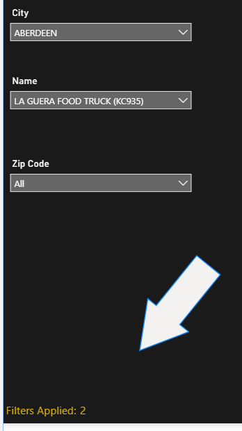
Our goal is to land a card displaying the number of dimensions we are filtered on to give the end user the ability to quickly see that filters are applied, and then hover on the card to see which filters are applied:
*Note that this does not count how many individual fields of a dimension are selected
Step One: DAX
The key to this method is creating DAX that will calculate the number of dimensions filtered. This is easily done through IF ISFILTERED functions that return a 1 for filtered, and 0 for not filtered, and then adding them up for all of the dimensions we are using as filters.
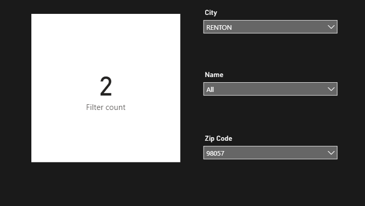
In this example, I am going to filter on the dimensions of City, Name, and Zip Code. Here is the DAX:
Filter count = IF(ISFILTERED(‘Table'[City]), 1, 0)+IF(ISFILTERED(‘Table'[Name]),1,0)+IF(ISFILTERED(‘Table'[Zip Code]), 1,0)
And here is the outcome:


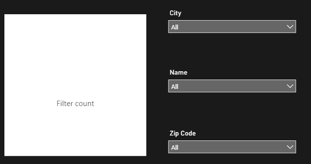
Now I will adjust the DAX so rather than a 0, we end up with a blank (note this is probably not optimal DAX, but it is functional. there is probably a better way to do this if you are a DAX lover):
Filter count = IF(IF(ISFILTERED(‘Table'[City]), 1, 0)+IF(ISFILTERED(‘Table'[Name]),1,0)+IF(ISFILTERED(‘Table'[Zip Code]), 1,0) = 0, “”, IF(ISFILTERED(‘Table'[City]), 1, 0)+IF(ISFILTERED(‘Table'[Name]),1,0)+IF(ISFILTERED(‘Table'[Zip Code]), 1,0))
Now we will create one more Measure to take care of the display label:
Filter count display = IF([Filter count]=””, “”, “Filters Applied:”)
Now that we have the DAX work done, it is time for formatting and placement
Step 2: Formatting the visuals:
There are three components to formatting for this. First, we will format and place the card and label (if applicable) itself, then we will format the Visual header and Filter pane to land the user experience.
The key to this feature is to make it subtle yet noticeable. If you use custom slicer panels, a good placement is with your button to active the slicer panel. If not, I like to go with lower corners or upper corners, but also need to call out that the number is representing the filters. I am going to demonstrate the latter, as it is more common.
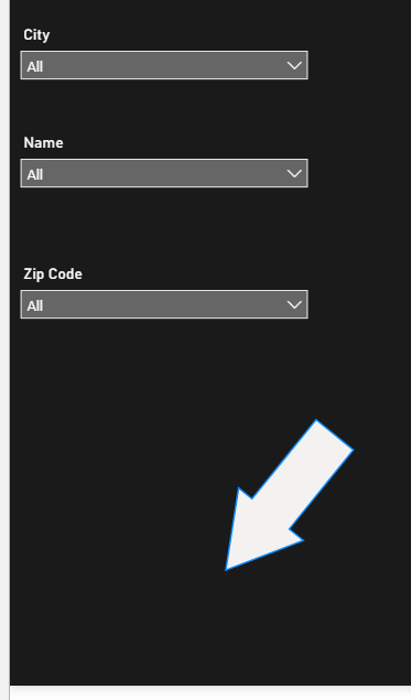
Start by creating a button that uses conditional Button text referencing the “Filter count display” measure we created above and has all other options turned off and give it a color that will stand out:

Next, we format the card with “Filter Count” measure in it to align with the Button. Here are a couple screenshots of the effect we created:

*This could totally be done as One measure that concatenates “Filters Applied” with the number, but Buttons do not have the Filter Icon in the visual header, and Cards do not allow the formatting precision required to make this perfect.
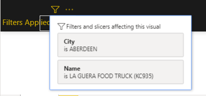
Now that we have taken care of the display, we need to bring in the ability to see what filters are applied. We are going to utilize the “Filter icon” Visual header of the card, and formatting of the filter pane to do this.
Step 3: Formatting the visual header
First things first, turn on the visual header if it is off and turn off all of the visual header elements except Filter icon.
I say this all the time, but it is incredibly important to be intentional with your visual headers! If the option is not one you want the user to work with, turn it off. It will eliminate confusion and give a clear purpose for the header.

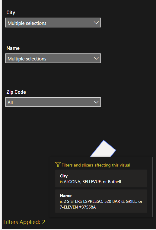
We now have a flyout list of filters applied when hovering on the Filter Icon:
But we are not done yet! The formatting of the filter flyout is based on the formatting of the Filter Pane, so we will want to customize the Pane to give this a consistent look and feel with the rest of the report. This might be done already if you take formatting that far and use the filter pane already.
Step 4: Formatting the filter pane and filter cards
To format the filter pane/filter cards, we start by clicking in blank space of the report. this allows us to see the filter pane formatting options under the visualization pane

Apply a consistent color scheme to the pane and filter cards
The formatting of the individual filters that pop up is done via Filter cards > Type: Applied


And here is how it looks with multi-select on a slicer:

Conclusion
While this is not the most “in your face” approach to displaying what filters are hitting a report, it can subtly be built into any report without taking up a ton of real estate and add a ton of value. In addition, dynamic Alt Text can be added to this Card to aid with accessibility. Hope this is helpful! PBIX can be found here for download.

Thank you for writing this, it’s perfect for a report I’ve just created. Will be having a go later.
Get Outlook for Android
________________________________
LikeLike
I used this and it’s brilliant, haven’t used visual headers before. I am not a DAX expert but I put it in a variable so the if statements were run once
LikeLike
_Leisure Filter Count =
VAR _FilterCount =
IF(ISFILTERED(
‘Leisure Categories'[Bene]), 1, 0) +
IF(ISFILTERED(
‘Leisure Categories'[Golf or Leisure]), 1, 0) +
IF(ISFILTERED(
‘Leisure Categories'[Demographics]), 1, 0) +
IF(ISFILTERED(
‘Leisure Categories'[Membership Name]), 1, 0) +
IF(ISFILTERED(
‘Leisure Categories'[Membership Type]), 1, 0) +
IF(ISFILTERED(
‘Leisure Categories'[Off Peak or Peak]), 1, 0)
Return
IF(_FilterCount = 0, “”, _FilterCount)
LikeLike